Color can play up or play down architecture, create a positive experience and more. Here’s how to put it to work for you
Thank you for reading this post, don't forget to leave a comment.
We all want our homes to provide comfort and ease. And something instinctual tells us that color — whether a can of paint, a bright new patterned rug, maybe that sun-drenched painting you saw at the last art opening you attended — can change our world for the better.
Springtime home maintenance offers a new opportunity to add the color we crave. And picking the right colors for our homes is not magic. The process simply requires that we look at the physical qualities of our home’s architecture and apply color that will put the focus where we want it. Here’s how.
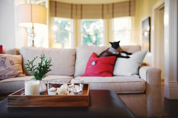
1. Study your home and the light that enters it. Rather than worrying about style and the artful assembling of accessories, consider the structure of your house and make a color strategy that works for movement and creature comforts first. By taking a look at each room and asking yourself, “What do I want to see?” you can create a plan that puts the focus where it is most important and will lead those in your life to experience your home as you want them to.
Start by touring your house the way your guests do. Drive up to your home, park, enter and try to see your home with fresh eyes. Make note of positive and negative attributes. Pay particular attention to the orientation of the house and the light that enters each room.
Sometimes using a camera’s viewfinder can help you see your home’s true potential. Snap a picture of each room as you enter and from different angles as you peruse the space. The pictures will help you see what you are working with.
Color is one of the most immediate and simplest ways to move walls and change the proportions of your house (visually, that is). But to make changes, you must understand the light that illuminates your living space and use it to accomplish your objectives.
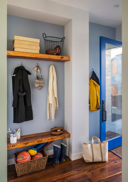
2. Create a positive entrance. Storage is key to organizing typically cluttered areas, like a front entrance or mudroom, but color is equally important. Use a light color for walls and trim for an entrance that is cramped. Small, awkward spaces expand when painted a cool white or blue, dropping walls back.
If you have an uncomfortably large foyer (with a cathedral ceiling and imposing staircase to the second floor), use yellow on the walls to bring it down in scale. Yellow will make the walls appear closer and sun-washed, which will start your guest’s experience off right and create a positive memory of home for your family on the go.
But it’s not just your walls. Make sure your entrance is free of items that blend in with the floor. Everyone can see those red rubber boots and avoid tripping on them, but items that match the floor in color and tone are a hazard.
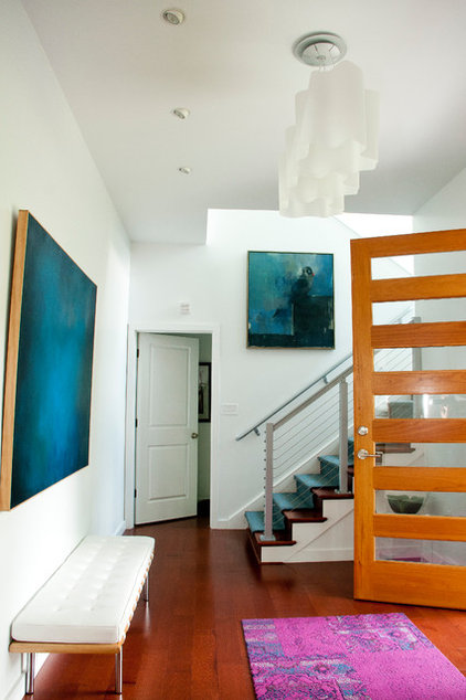

3. Simplify angles with color. Keeping the flight path through your house free and clear includes diminishing harsh ceiling angles and edges. A grayed color on the walls and ceiling can unify shadows and take away the hard lines that come with the intersection of forms. Softening the angles with color can redirect the emphasis from the awkward to something else — say, a painting or series of family photographs.
Streamlining architecture by minimizing color shifts works for all parts of the house. One client told me that she went to bed each night looking at icebergs overhead. Clearly the “ceiling white” used to color the series of odd triangular forms of her cathedral ceiling had created an ominous focus that kept her up at night. A quiet tone of a green-white on the ceiling and walls did away with the arctic landscape while bringing the attention to the soft furnishings that supported a sound sleep.
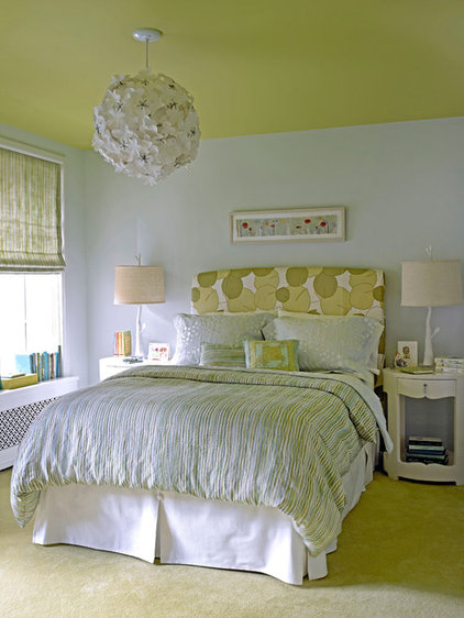

If your room misses out on abundant sunlight, use color to create the illusion of it. A light sisal gold on the walls will create a cozy place in which to flop.

The visual presence of architectural elements can be controlled by the value and intensity of their color. Want something to stand out and make an impression? Paint it the most saturated or contrasting color in the room.
If you want something to go away, paint it the same color as its surroundings. Is something too large and imposing for your space? Choose a color that is dark and gray. Charcoal will shrink and set what was once a foreground element into the shadows.
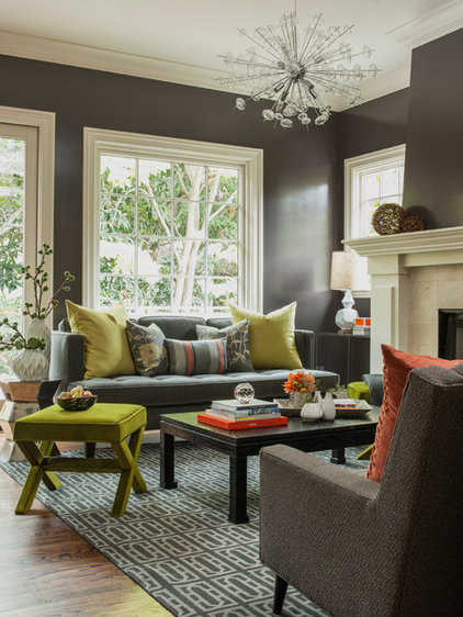
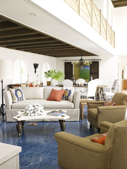
Creating visual pathways may not be your idea of a priority when designing your interior, but it is one of the strongest subliminal visual pursuits of your family and guests. Use color for visual touchstones, and your visitors will compliment you on your calm, beautiful home.
